Posts Tagged: user interface

User Interface improvements in v4.41

Whilst we love adding new and improved features in every software update, we also know that user interface (UI) and user experience (UX) are important too!

We’ve made a number of UI/UX improvements for our latest update. Some of these will be immediately noticeable, others are more subtle.

In this post, we’ll highlight some of the UI and UX improvements in MIDAS v4.41.

A more concise user bar

If you’ve been using MIDAS for a while, you’ll be familiar with the “user bar” which is shown directly under the main date heading:

The "user bar" in previous versions of MIDAS
The previous “user bar” in earlier versions of MIDAS

The “user bar” indicated who was signed in, and provided options to sign out, change your password, access help, or make MIDAS go fullscreen. You could also click your name to show a list of all the devices you were currently signed in from.

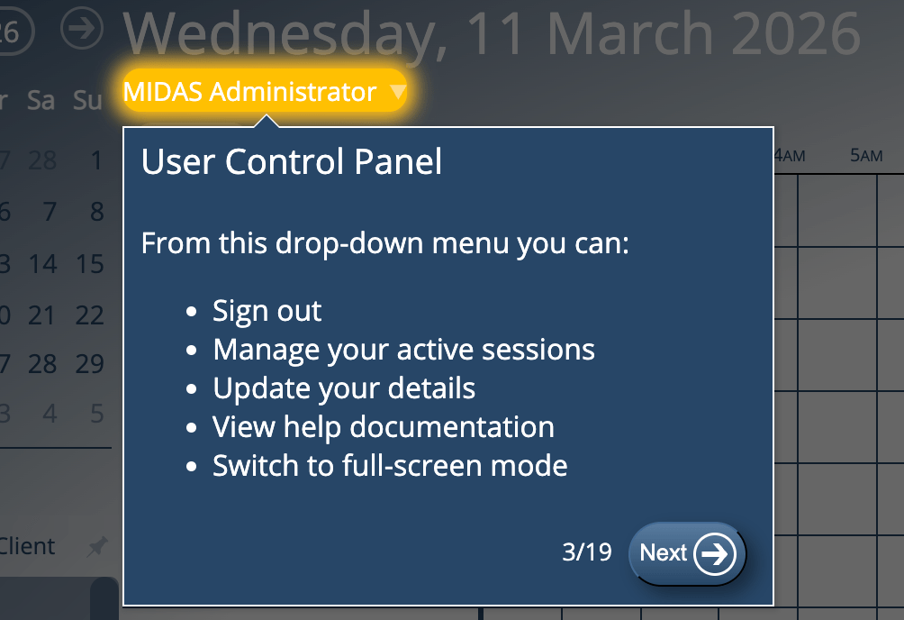
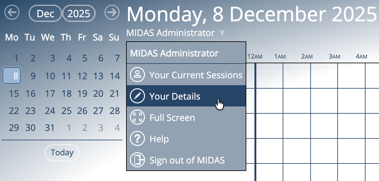
We’ve decluttered this area for v4.41. Now, just your name will be shown under the main date. You can select your name and a new drop-down list will appear:

New User Drop-Down in MIDAS v4.41

This new drop-down contains the following options:

  • Your Current Sessions – view details of all the devices you’re currently signed into MIDAS from, and remotely sign out any you’re not actively using.
  • Your Details – as v4.41 introduces new permissions allowing users to change their name or email, the previous “Change Password” link has now become a “Your Details” option in the new drop-down. Depending on the permissions assigned to your account, this option will allow you to change your display name, password, or the email address you use to access MIDAS.
  • Full Screen – quickly enter or exit full screen mode.
  • Help – open the help documentation.
  • Sign out of MIDAS – instantly sign out at any time.

New icons

You may have spotted some new icons alongside the options in that new user drop-down above.

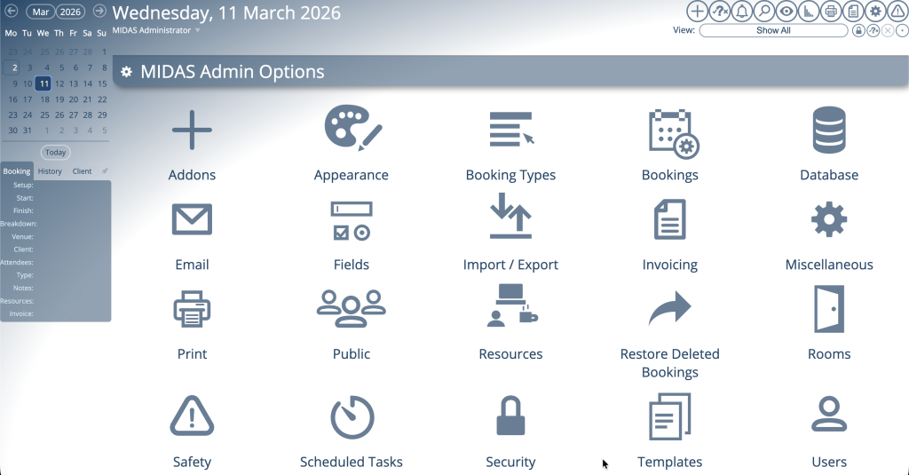
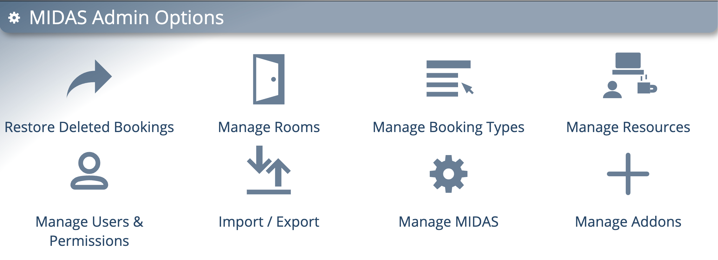
Well, this isn’t the only place you’ll see some new icons in MIDAS v4.41. We’ve also created a new set of icons for the options on the main administration creen:

New icons on the MIDAS Admin Options screen

Previously all the options on this screen used the “cog” icon used for the “Manage MIDAS” option. We felt it was about time for a refresh, and that each of the options on this screen deserved their own unique icons.

Improved graphs with tooltips

In case you missed our post a few days ago, for v4.41 we’ve rewritten the graphics code that MIDAS uses to generate graphs on the statistics (reporting) screen.

Graphs now have tooltips

Bar graphs and pie charts now show tooltips when you move your cursor over each segment. Furthermore, we’ve also adjusted how dates are shown along the bottom axis in bar charts to prevent overcrowding.

Info, Tips, Warnings, and More!

The help documentation has also had a bit of makeover for v4.41. Not only have we improved its accessibility, we’ve also made some visual changes.

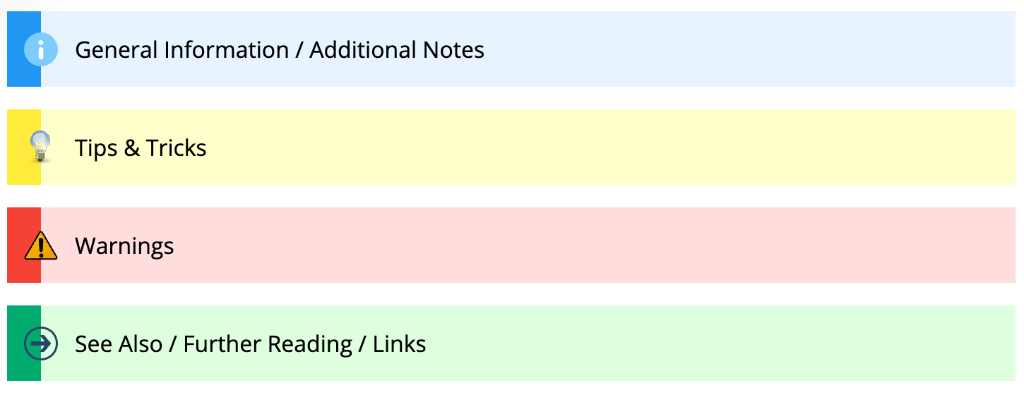
Throughout the documentation you’ll see coloured boxes with either additional information, helpful tips, warnings, or links to more resources.

Here’s how these looked in the documentation before v4.41:

Info Boxes pre-v4.41

…and here how these look now:

New Info Boxes in MIDAS v4.41

It doesn’t end there!

Whilst these might be the main UI/UX improvements we’ve made for v4.41, we’ve also made numerous other small improvements to the user interface and user experience in our latest update – too many to list here!

So whilst we’ll continue to add exciting new features and functionality with every new release, we’ll also be working to continually improve your user experience too!


From Blue To Cool: We’ve given the MIDAS UI a makeover

For v4.36 of our booking software, we’ve made a whole host of updates and improvements to the user interface (UI) and the included visual themes.

For many years now, MIDAS has come bundled with a number of visual theme packs.

A range of visual themes for the MIDAS interface are included

Administrators can select one of these themes to change the appearance of their MIDAS system. Additionally, administrators may optionally allow users to select their preferred theme upon login.

One of the included themes is the imaginatively titled “Default” theme. Unsurprisingly, it’s the visual theme that each MIDAS system uses initially by default.

As the “Default” theme is exactly that, many system administrators simply leave their MIDAS software set to use this theme.

In fact, from a random sample of our cloud-hosted customers, 72% of MIDAS systems are currently set to use the “Default” theme.

It’s black and white!

Interestingly though, the next most popular theme in our random sample of customer’s MIDAS systems is the “HiContrast” theme. Nearly 13% of our customers currently have this set as their default theme.

Hi Contrast theme for MIDAS

Now the primary goal when we designed the “HiContrast” theme was accessibility. In other words, we wanted to better cater to users who may have visual impairments.

The “HiContrast” theme is less colorful than our other themes. It primarily utilizes a simple “black on white” concept throughout, ensuring maximum contrast on screen.

Whilst a surprising number of our customers choose this theme, we don’t believe the vast majority opt for this particular theme primarily because of accessibility needs.

It’s all too Blue-tiful(!)

Rather, we believe that many who opt for the “HiContrast” theme do so because they feel that the “Default” theme is a bit “too blue” for their liking.

The previous Default theme for MIDAS

We get it! That’s one of the reasons why over the years, we’ve introduced additional visual themes where blue isn’t the main color.

We also allow self-hosted customers to create their own custom bespoke themes for our software too!

But going forward, we wanted to see if we develop a new default theme that was “less blue” than the existing default theme, while also at the same time being less “bland” than the basic black and white “HiContrast” theme.

Introducing the new default theme…

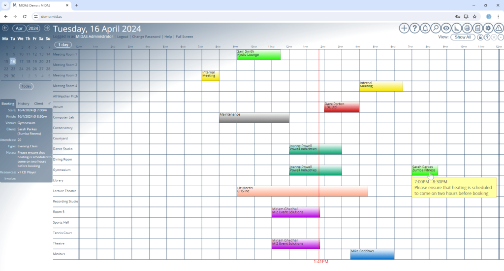
The most significant UI update for MIDAS v4.36 comes with a brand new “Default” visual theme:

The Booking Grid under the new default visual theme for MIDAS
The Booking Grid under the new default visual theme

If you prefer the previous default theme, don’t worry – it’s still available, but is now called “MIDAS (Blue)”.

We’ve also made a number of other improvements to the user interface, as well as minor tweaks to other included themes. Some text and headings are now larger than before, dialogs are clearer, there’s increased spacing between certain elements, and some interactive buttons are now larger and more prominent.

The new default theme for MIDAS

You can try the brand new “Default” theme, or any other included theme, right now by heading over to our online demo.


User Interface Improvements

For v4.25, we’ve made a number of small but significant improvements to the user interface. These include..

New Default Font

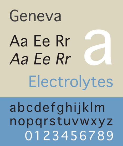
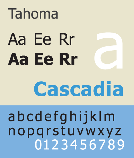
Since MIDAS v4.20, the default font used in our software was “Geneva” on MacOS systems and “Tahoma” on Windows systems. Different platforms have different default fonts available, and we wanted MIDAS to look as similar as possible regardless of the OS being used. “Geneva” and “Tahoma” are quite similar in appearance, which is why we originally chose them.

Geneva Font
“Geneva” Font
Tahoma Font
“Tahoma” Font

For other systems where neither of these fonts were available, MIDAS would fall back to the closest sans-serif font available.

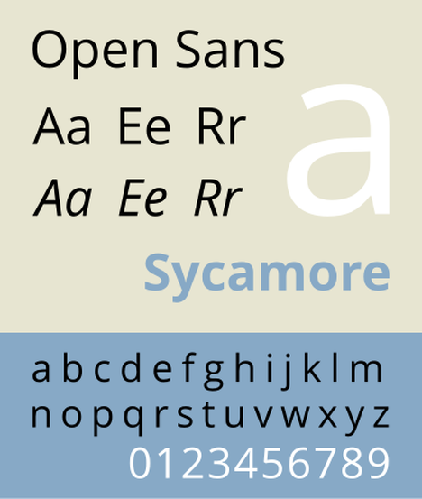
However, from v4.25, the default font across all operating systems is instead now “Open Sans“:

Open Sans Font
“Open Sans” Font

This font comes included with MIDAS, meaning that our software should now look identical on every operating system!

Larger Font Size

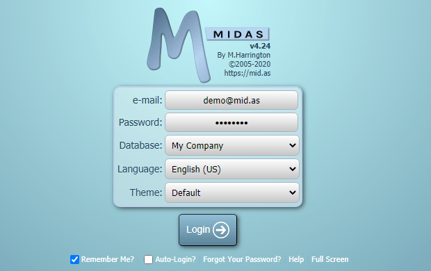
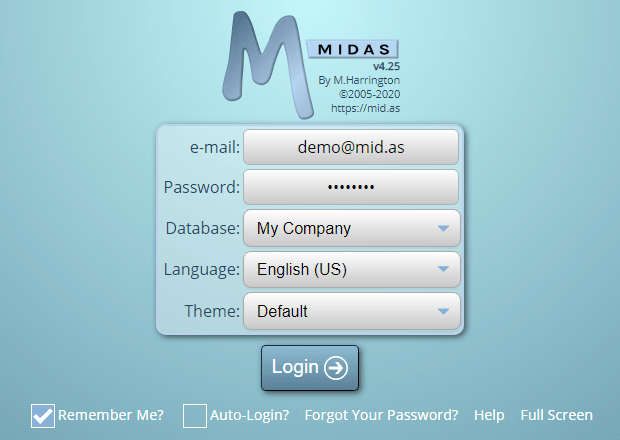
Following customer feedback, we’ve also increased the font size in many areas of the software.

MIDAS v4.24 Login Screen
Previous Font Size in MIDAS v4.24
MIDAS v4.25 Login Screen with increased font size
Increased Font Size in MIDAS v4.25

New Drop-Down Lists, Checkboxes and Radio Buttons

You may also note from the previous screenshot a couple of other changes. We’ve fully styled and themed drop-down (select) lists, check (tick) boxes and radio buttons in MIDAS v4.25. Previously, these input elements would be styled by the user’s own browser/operating system. This led to MIDAS looking slightly different for users on different browsers and operating systems.

System default styled Check (Tick) Boxes and Radio Buttons in v4.24
Styled Check (Tick) Boxes and Radio Buttons in v4.25

The new styled inputs for v4.25 look consistent across supported browsers and operating system. Coupled with the increased font size, these new-style inputs are now even easier to select/toggle than before.

Default Template Improvements

We’ve updated a couple of the default templates for v4.25. The “Public Booking Requests” and “Public Web Request” templates have been updated.

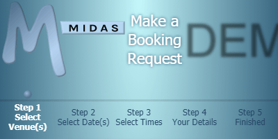
Previously, these template defaults made use of an HTML “table” for laying out the header. This worked fine on regular screens, but on smaller mobile devices, it could result in the header being truncated:

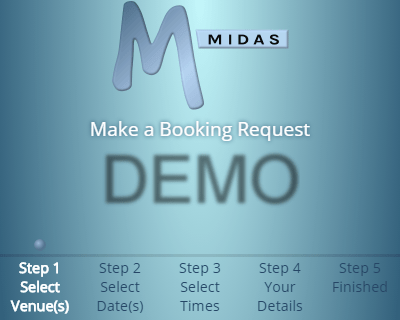
Public Booking Request Default Template in v4.24, using a 'Table' Layout
Public Booking Request Default Template in v4.24 on a mobile device, using a “Table” Layout.
Note how the “DEMO” logo has been truncated

So to improve their appearance on smaller screens, for v4.25, we’ve dropped the use of tables in favor of a “flex” layout instead. Here’s the same screen as before, but using a “flex” layout instead. Now on smaller screens, the header components will “wrap” where necessary:

Public Booking Request Default Template in v4.25, using a 'Flex' Layout
Public Booking Request Default Template in v4.25 on a mobile device, using a “Flex” Layout.
Note how the header components automatically “wrap” on very small screens

We would ideally like to migrate all the default templates (email, invoice, etc) within MIDAS over to a “flex” layout model. However, older email clients don’t fully support “flex” rendering in this way. This would mean that an invoice emailed to a customer may not display correctly in their email client. We do however plan to one day update all default templates to the “flex” layout model. In the meantime, as templates within MIDAS are editable, user may choose to do this themselves!

These improved templates apply to new installations of our software. They won’t be retrospectively applied to existing MIDAS systems. However, existing customers can reset their templates to these new templates via MIDAS Admin Options → Manage MIDAS → Templates → Reset Template.


These are just a few of the new and improved features for v4.25. Keep following our blog as we unveil more on v4.25 in our next posts.

Reddit You can also ask questions and discuss the new features of v4.25 over on Reddit.