Posts Tagged: theme

From Blue To Cool: We’ve given the MIDAS UI a makeover

For v4.36 of our booking software, we’ve made a whole host of updates and improvements to the user interface (UI) and the included visual themes.

For many years now, MIDAS has come bundled with a number of visual theme packs.
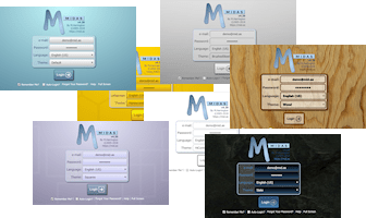
A range of visual themes for the MIDAS interface are included

Administrators can select one of these themes to change the appearance of their MIDAS system. Additionally, administrators may optionally allow users to select their preferred theme upon login.

One of the included themes is the imaginatively titled “Default” theme. Unsurprisingly, it’s the visual theme that each MIDAS system uses initially by default.

As the “Default” theme is exactly that, many system administrators simply leave their MIDAS software set to use this theme.

In fact, from a random sample of our cloud-hosted customers, 72% of MIDAS systems are currently set to use the “Default” theme.

It’s black and white!

Interestingly though, the next most popular theme in our random sample of customer’s MIDAS systems is the “HiContrast” theme. Nearly 13% of our customers currently have this set as their default theme.

Hi Contrast theme for MIDAS

Now the primary goal when we designed the “HiContrast” theme was accessibility. In other words, we wanted to better cater to users who may have visual impairments.

The “HiContrast” theme is less colorful than our other themes. It primarily utilizes a simple “black on white” concept throughout, ensuring maximum contrast on screen.

Whilst a surprising number of our customers choose this theme, we don’t believe the vast majority opt for this particular theme primarily because of accessibility needs.

It’s all too Blue-tiful(!)

Rather, we believe that many who opt for the “HiContrast” theme do so because they feel that the “Default” theme is a bit “too blue” for their liking.

The previous Default theme for MIDAS

We get it! That’s one of the reasons why over the years, we’ve introduced additional visual themes where blue isn’t the main color.

We also allow self-hosted customers to create their own custom bespoke themes for our software too!

But going forward, we wanted to see if we develop a new default theme that was “less blue” than the existing default theme, while also at the same time being less “bland” than the basic black and white “HiContrast” theme.

Introducing the new default theme…

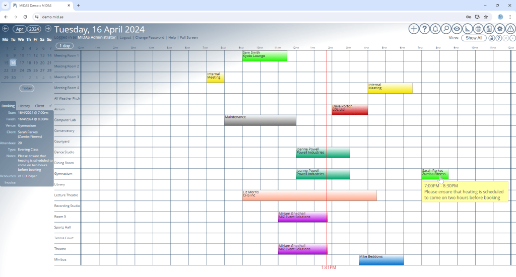
The most significant UI update for MIDAS v4.36 comes with a brand new “Default” visual theme:

The Booking Grid under the new default visual theme for MIDAS
The Booking Grid under the new default visual theme

If you prefer the previous default theme, don’t worry – it’s still available, but is now called “MIDAS (Blue)”.

We’ve also made a number of other improvements to the user interface, as well as minor tweaks to other included themes. Some text and headings are now larger than before, dialogs are clearer, there’s increased spacing between certain elements, and some interactive buttons are now larger and more prominent.
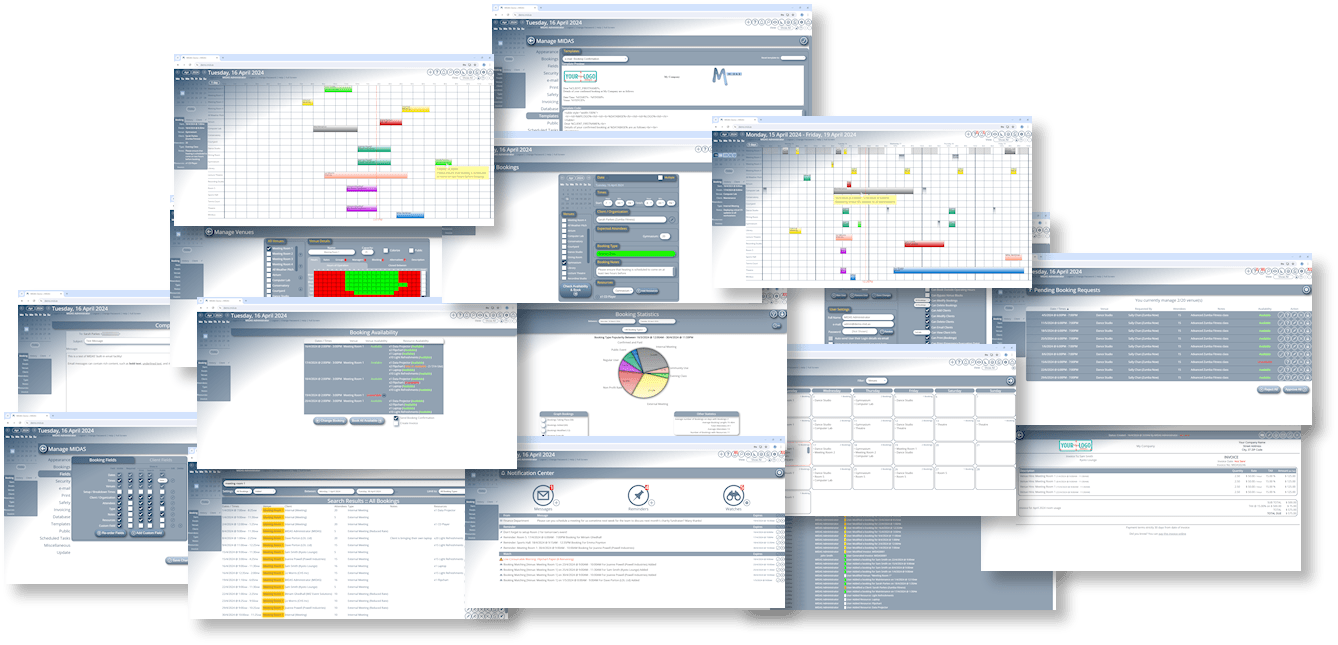
The new default theme for MIDAS

You can try the brand new “Default” theme, or any other included theme, right now by heading over to our online demo.

Theme Improvements

Following on from our previous post, you’ll know about some of the difficulties and challenges we’ve faced over the years in ensuring a consistent user experience can be delivered for our users, regardless of which web browser they’re using.

In response to customer feedback, updating and improving some of the visual elements of MIDAS has been the main focus for our next update, v4.20.

This blog post outlines some of the key visual changes we’re making in order to improve the user interface (UI).


Deprecating some old, less popular themes

The standard (non-HiRes) version of the “Default” theme is being retired, along with the “Pastel” and “Classic” themes.

Pastel Theme for MIDAS

The “Pastel” theme (shown above) was the least used optional theme by our customers. We may re-introduce a similar theme in the future, but for now the “Pastel” theme will no longer be available in v4.20

Classic v3 Theme for MIDAS

The “Classic” theme (shown above) was originally introduced with the release MIDAS v4.00. It was based on the icons in the previous pre-v4.00 interface for MIDAS. As there were significant changes made to various icons between MIDAS v3 and v4, the “Classic” theme’s primary purpose was to ease the transition to v4 for long standing customers familiar with icons from v3. MIDAS v3 was superseded by v4 over six years ago now, and so this interface is now very dated. As such, the “Classic” theme will no longer be available inn MIDAS v4.20.

Standard Resolution Default Theme for MIDAS

The non-HiRes version of the “Default” theme (shown above) was primarily aimed at self-hosted customers who were installing MIDAS onto a server which didn’t support serving SVG images. The non-HiRes default theme version was identical to the “Default-HiRes” theme, but with high resolution SVG icons substituted for lower resolution PNG images.

Nowadays, all modern servers can be configured to correctly serve SVG images. The majority of which being able to serve such content natively. (All our cloud-hosted customers are defaulted to the high resolution, rather than the standard resolution, “Default” theme)

The original purpose of the non-HiRes “Default” theme is therefore pretty redundant, and so has been removed from v4.20.


Updating Existing Themes

High Resolution SVG graphics in MIDAS

The previous “Default-HiRes” theme has been updated and renamed to “Default” for v4.20. The “BrushedSteel”, “HiContrast” and “Slate” themes have all had a face lift too. All of these themes now boast high resolution SVG icons, and improved layouts.

Brushed Steel Theme for MIDAS
High Contrast Theme for MIDAS
Dark Slate Theme for MIDAS

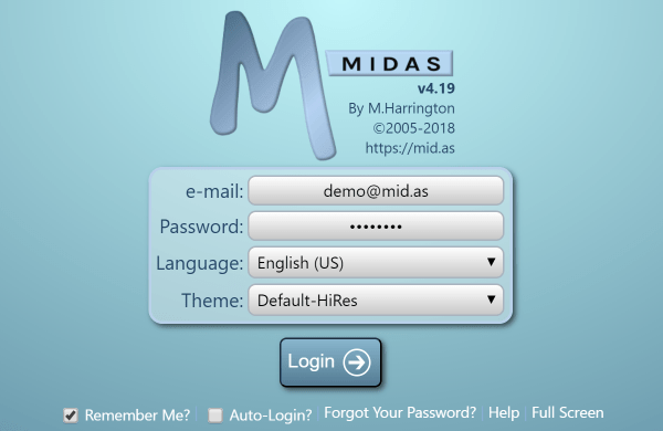
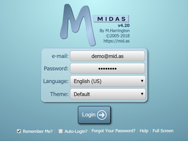
We’ve also increased the size of some visual elements to better aid those with sight difficulties or those accessing MIDAS on very small screen devices. Here’s a comparison of the login screen under the hi resolution “Default” themes in both v4.19 (left) and v4.20 (right):

MIDAS v4.19 login screenMIDAS v4.20 login screen
v4.19 Login Screenv4.20 Login Screen

Introducing New Themes!

We’re also adding THREE exciting new, high resolution themes to v4.20!

Honeycomb

New Honeycomb theme for MIDAS

Squares

New lilac Squares theme for MIDAS

Wood

New Wood effect theme for MIDAS

Additional new themes may also be added in the future. For v4.20 though a total 7 distinctly different themes will be included as standard. No longer will there be a need to download and install (in the case of self-hosted customers) or request (in the case of cloud-hosted customers) optional themes for your MIDAS system. All 7 of these themes are included as standard.


Custom themes

Self-hosted customers will still be able to “tweak” and customize their own visual themes for MIDAS. However, the process for doing this is slightly different than before. We’ve updated our Knowledge Base with instructions in this regard.


Future development

The new way in which themes are handled starting with v4.20 make it easier for us to introduce further themes in the future. It also serves to lay future foundations for an often requested “white label” edition of MIDAS.


MIDAS v4: A Fresh New Look

If you’ve been following our recent blog posts, you’ll know we have an exciting update coming to MIDAS! You may also have noticed from early screenshots we’ve already posted from this update that the default visual “theme” has also gone through some changes…..

The previous “Default” theme: (MIDAS v3)

MIDAS v3 Default Theme

The new “Default” theme: (MIDAS v4)

MIDAS v4 Default Theme

The new “Metro” inspired default theme that will ship with MIDAS v4 will feature slightly larger icons than previous themes – the reasons behind this are two-fold;

1) Larger Screen Resolutions

Firstly, screen resolutions are generally getting larger – for many years the most common screen resolution was 1024 x 768 pixels. A recent study found that currently the most common screen resolution in use is 1366 x 768. As people choose screens with higher and higher resolutions, graphical items appear comparatively “smaller” on screen.

2) Touch Screens

Secondly, touch screen devices (such as tablets and iPads) are now common place, and with the eagerly anticipated release of Microsoft’s Windows 8 operating system later this year (which is very much geared towards touch screen devices), we expect the number of touch-enabled devices to increase dramatically.

If you’re familiar with touch screen devices, you’ll know it can sometimes be frustrating trying to accurately “tap” a very small target area on screen.

Microsoft have conducted extensive research on fingers and touch screens. They discovered that the average width of a human finger is 11mm. As targets for tapping get larger, the percentage of accidental missed taps drops off quickly. Therefore, ideally, a tap target should be at least 11mm (about 40px) in size.

MIDAS v3 IconMIDAS v4 Icon
“Add Bookings” icon (MIDAS v3)
30 x 30 pixels
“Add Bookings” icon (MIDAS v4)
40 x 40 pixels

In the previous “default” theme for MIDAS, the main toolbar icons were 30 x 30 pixels in size. In the new “default” theme, toolbar icons are now 40 x 40 pixels in size.

Notifications have also been made more prominent on toolbar icons for MIDAS v4:

MIDAS v4 Toolbar Notifications
MIDAS v3 ButtonsMIDAS v4 Buttons
Buttons in MIDAS v3Buttons in MIDAS v4

We’ve also increased the size of other buttons and some text elements – all in an effort to make MIDAS more accessible to tablet, iPad, and other touch screen users, and those using higher resolution screens!

We hope you’ll like the new look for MIDAS v4, but if you don’t, no problem! – There will be a version of the previous MIDAS v3 default theme available for v4 as well!