For v4.36 of our booking software, we’ve made a whole host of updates and improvements to the user interface (UI) and the included visual themes.
For many years now, MIDAS has come bundled with a number of visual theme packs.
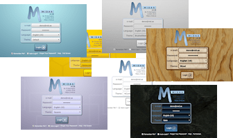
Administrators can select one of these themes to change the appearance of their MIDAS system. Additionally, administrators may optionally allow users to select their preferred theme upon login.
One of the included themes is the imaginatively titled “Default” theme. Unsurprisingly, it’s the visual theme that each MIDAS system uses initially by default.
As the “Default” theme is exactly that, many system administrators simply leave their MIDAS software set to use this theme.
In fact, from a random sample of our cloud-hosted customers, 72% of MIDAS systems are currently set to use the “Default” theme.
It’s black and white!
Interestingly though, the next most popular theme in our random sample of customer’s MIDAS systems is the “HiContrast” theme. Nearly 13% of our customers currently have this set as their default theme.

Now the primary goal when we designed the “HiContrast” theme was accessibility. In other words, we wanted to better cater to users who may have visual impairments.
The “HiContrast” theme is less colorful than our other themes. It primarily utilizes a simple “black on white” concept throughout, ensuring maximum contrast on screen.
Whilst a surprising number of our customers choose this theme, we don’t believe the vast majority opt for this particular theme primarily because of accessibility needs.
It’s all too Blue-tiful(!)
Rather, we believe that many who opt for the “HiContrast” theme do so because they feel that the “Default” theme is a bit “too blue” for their liking.

We get it! That’s one of the reasons why over the years, we’ve introduced additional visual themes where blue isn’t the main color.
We also allow self-hosted customers to create their own custom bespoke themes for our software too!
But going forward, we wanted to see if we develop a new default theme that was “less blue” than the existing default theme, while also at the same time being less “bland” than the basic black and white “HiContrast” theme.
Introducing the new default theme…
The most significant UI update for MIDAS v4.36 comes with a brand new “Default” visual theme:
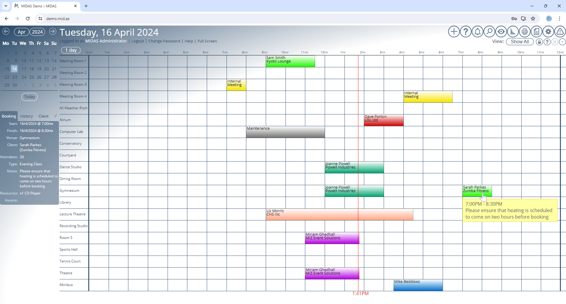
If you prefer the previous default theme, don’t worry – it’s still available, but is now called “MIDAS (Blue)”.
We’ve also made a number of other improvements to the user interface, as well as minor tweaks to other included themes. Some text and headings are now larger than before, dialogs are clearer, there’s increased spacing between certain elements, and some interactive buttons are now larger and more prominent.
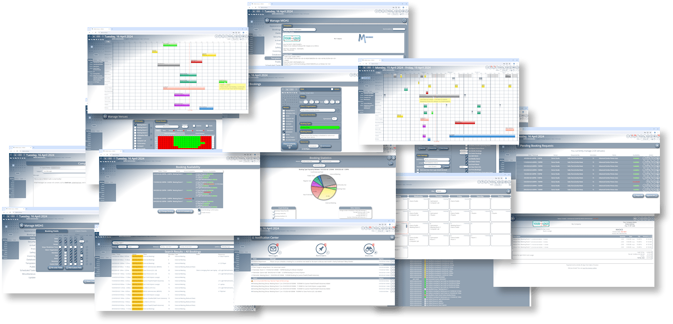
You can try the brand new “Default” theme, or any other included theme, right now by heading over to our online demo.