We’ve completely re-written the code which generates graphical reports and statistics in MIDAS for v4.41.
Previously, bar graphs and pie charts were dynamically rendered within HTML <canvas> elements. This had a number of limitations, and so starting with v4.41, we’ve switched to dynamically rendering graphs using SVG instead.
The most notable benefit to this is that we can now show “tooltips” when you hover over elements within a graph.
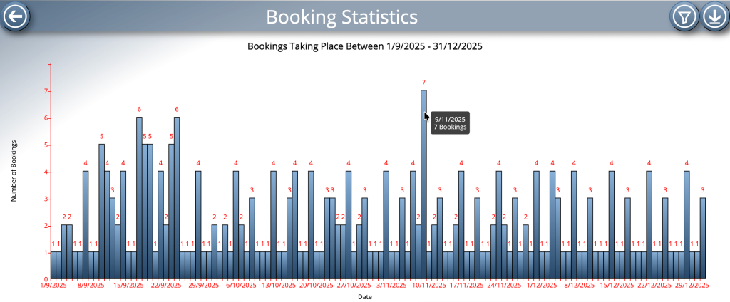
Another issue we’ve addressed when rewriting graph code is that of x-axis scaling.
Most vertical bar graphs which MIDAS can generate have dates along their x-axis. As MIDAS allows you to select a date range for many generated reports, the resulting x-axis could represent a single date, or a very wide date range spanning several years.
Until now, MIDAS would label each date within the selected range on the X-axis. For larger date ranges, these labels would all overlap causing an illegible mess along the X-axis.
Now that we’re able to bring dynamic “tooltips” to graphs in v4.41, it’s no longer necessary to display labels for every date in the selected range along the bottom axis. That’s because these tooltips will show the date of the bar your cursor is ‘hovering’ over.
Consequently, for large date ranges, the X-axis will now only be labelled with select dates within that range. This produces a far clearer bottom axis, which we’re sure you’ll appreciate.
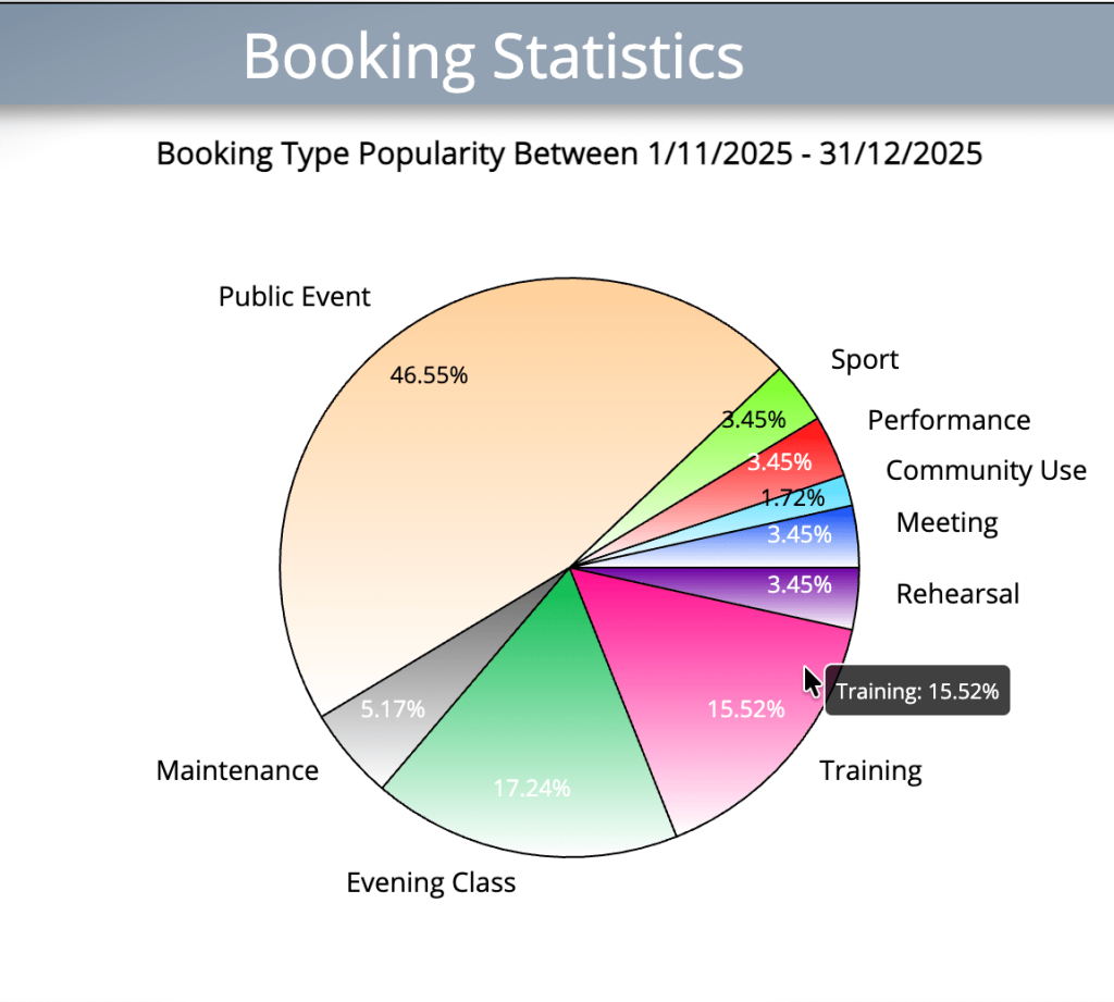
Floating “tooltips” aren’t just confined to bar charts – they’ve also been added to pie charts too!